IAG-ng
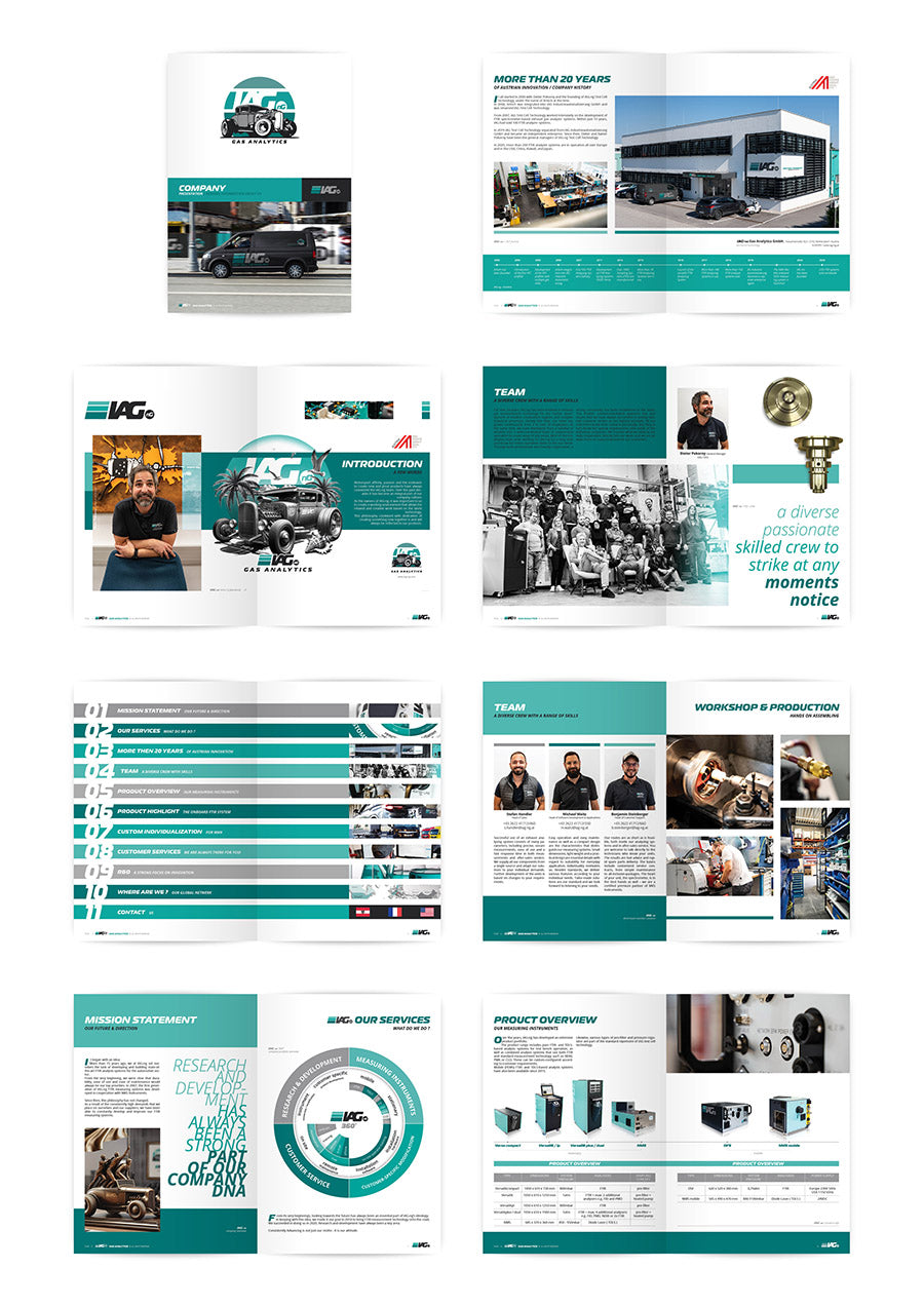
Image transformation
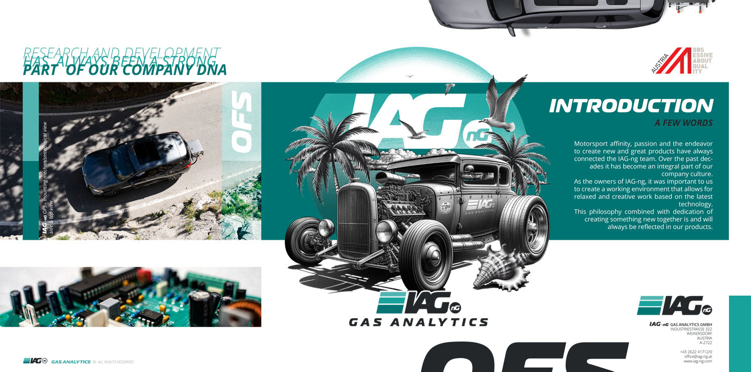
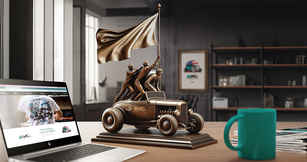
Company brochure
The starting point for the image transformation was deliberately chosen to be classic: a company brochure served as a creative and strategic foundation to develop key elements of the repositioning – without changing the existing logo.
- Development of additional branding elements to expand the visual identity
- Collection and structuring of all relevant content for the new website
- Production of graphic content that visually conveys the new tone.
- Reflection on the company's self-perception and desired external image
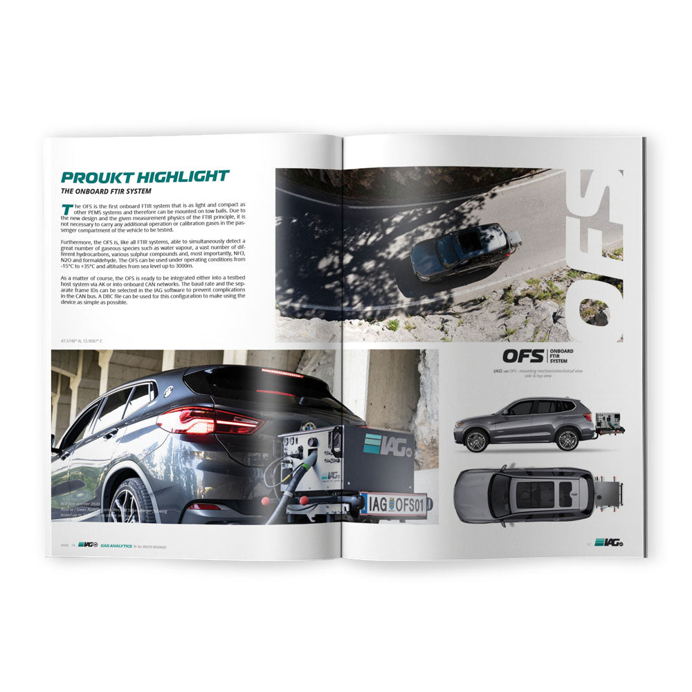
Image transformation
Company brochure
The brochure thus became an internal compass – a medium that helped define attitude, style and strategic direction.
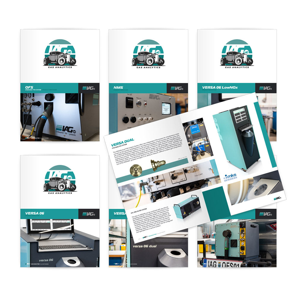
Image transformation
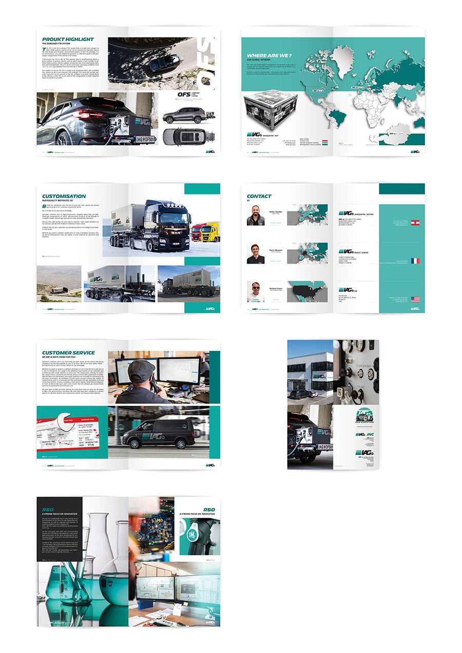
Product brochures
The products were re-photographed and converted into a presentation format according to the style guide of the company brochure.
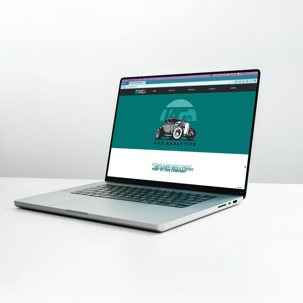
The account transfer
Website
Based on the content developed for the company brochure, the next step was the design of the new website. The brochure served as a strategic guideline and content foundation.
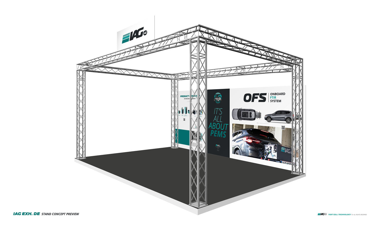
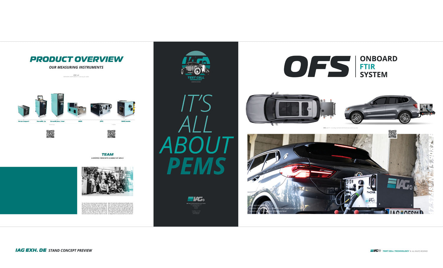
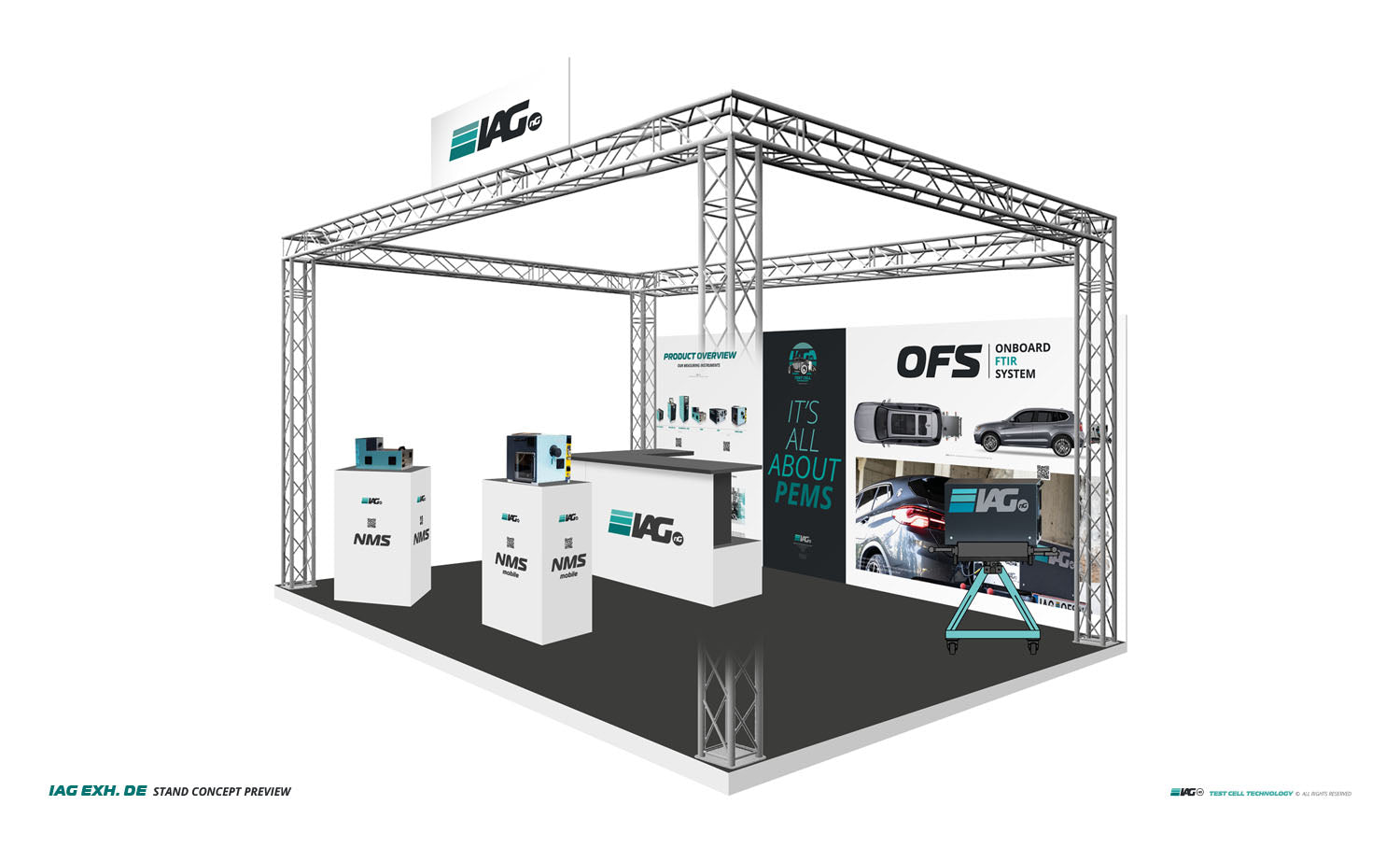
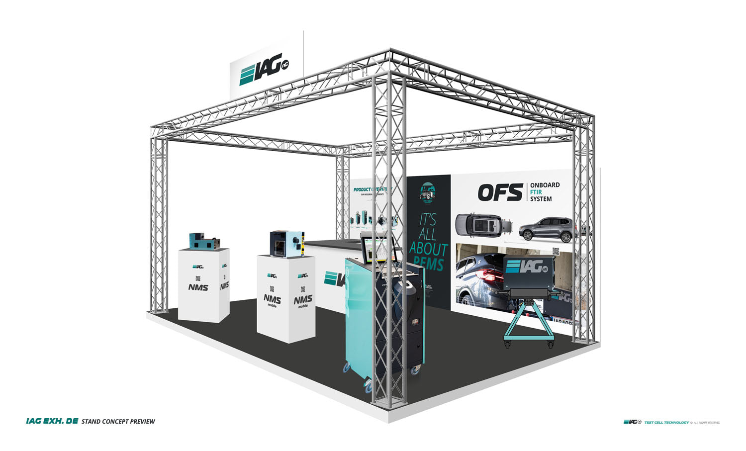
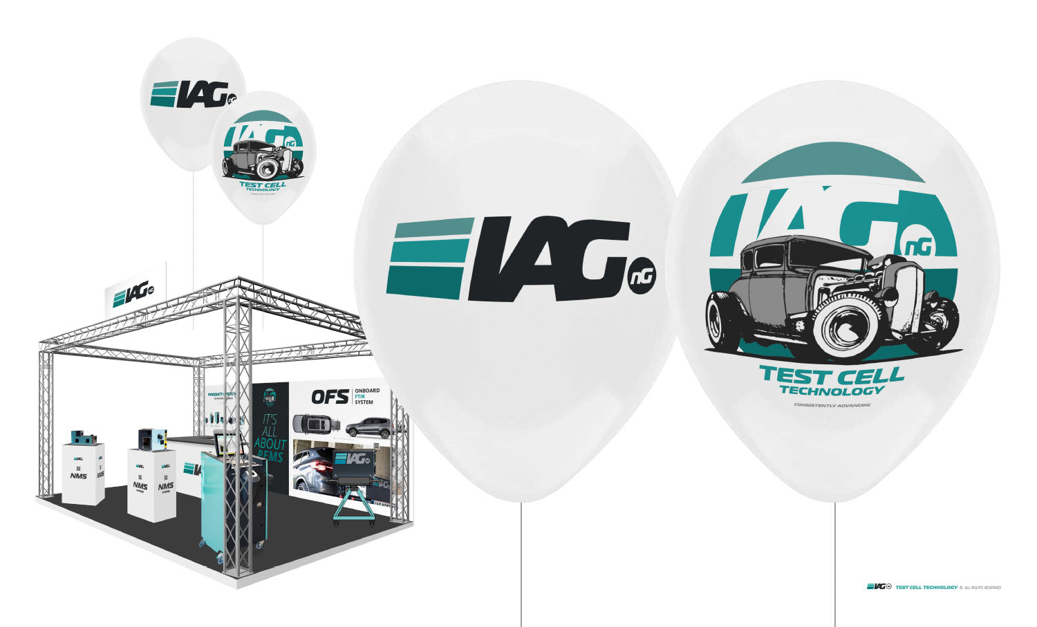
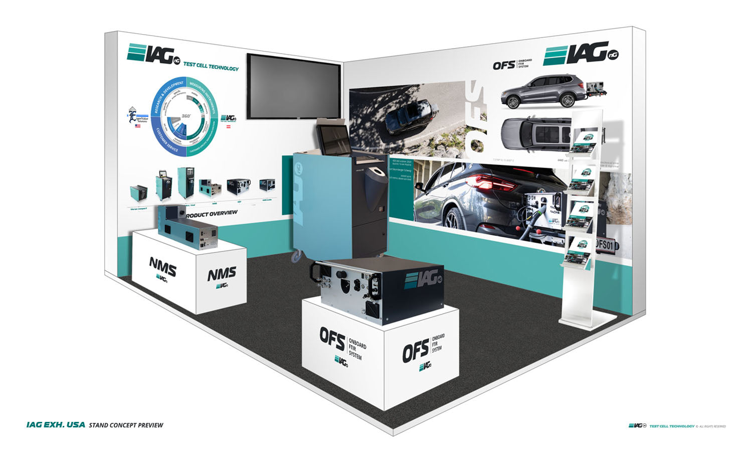
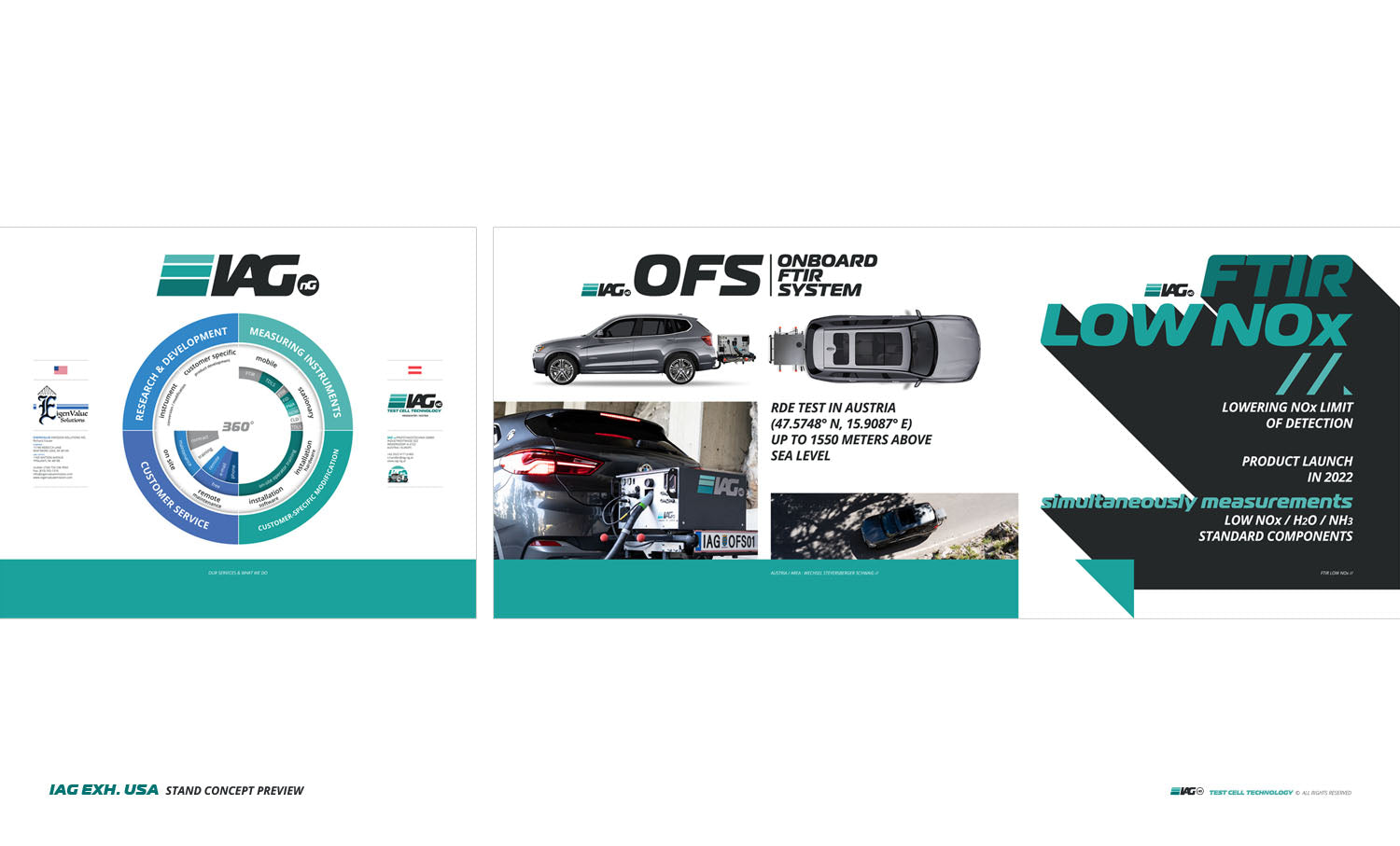
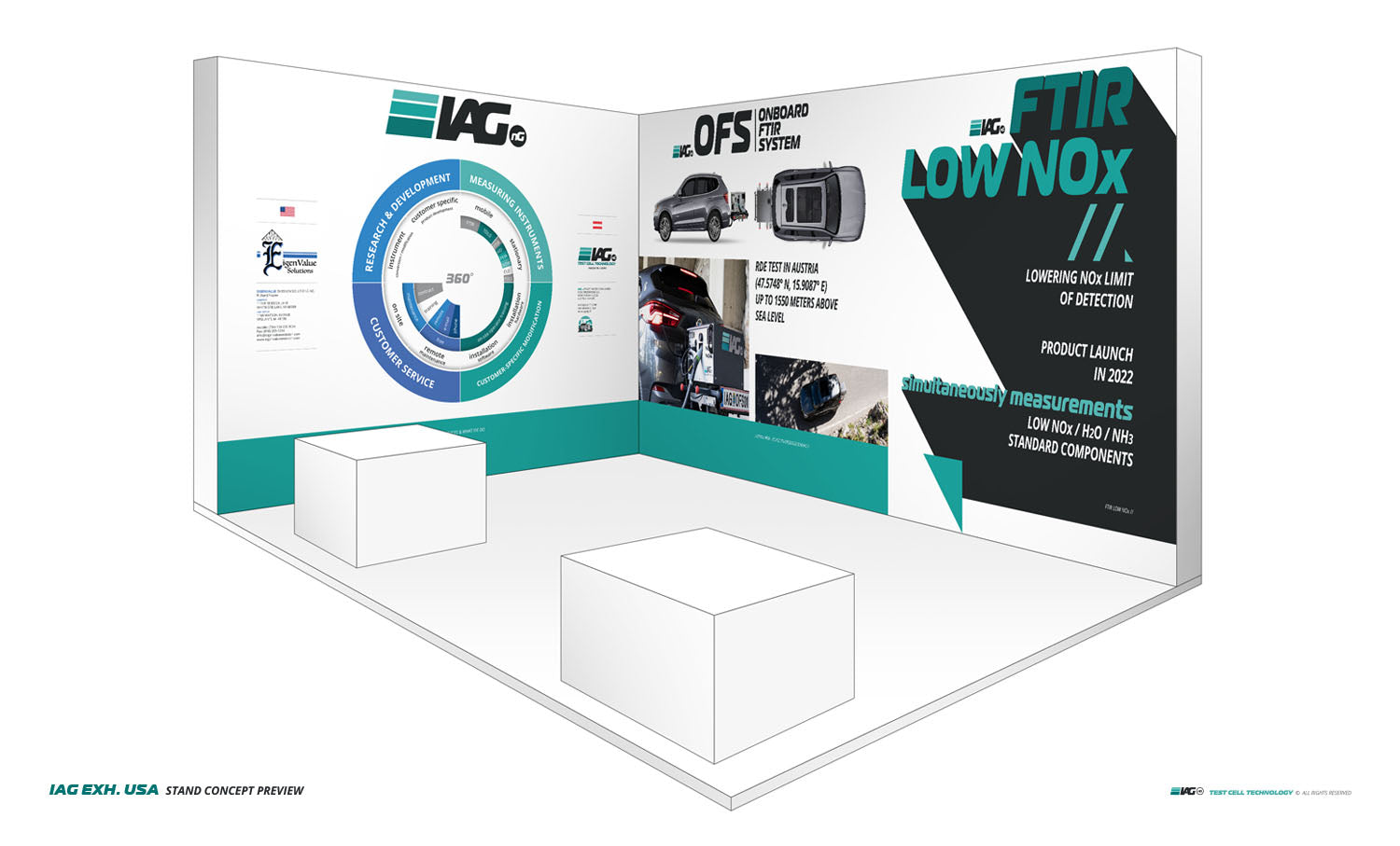
Exhibition stand Germany
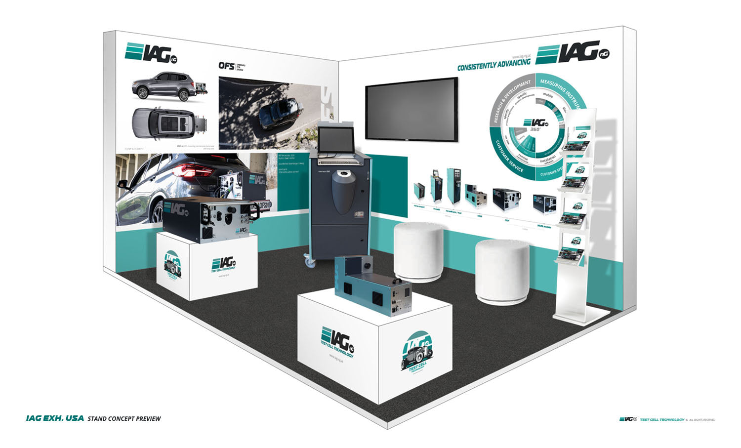
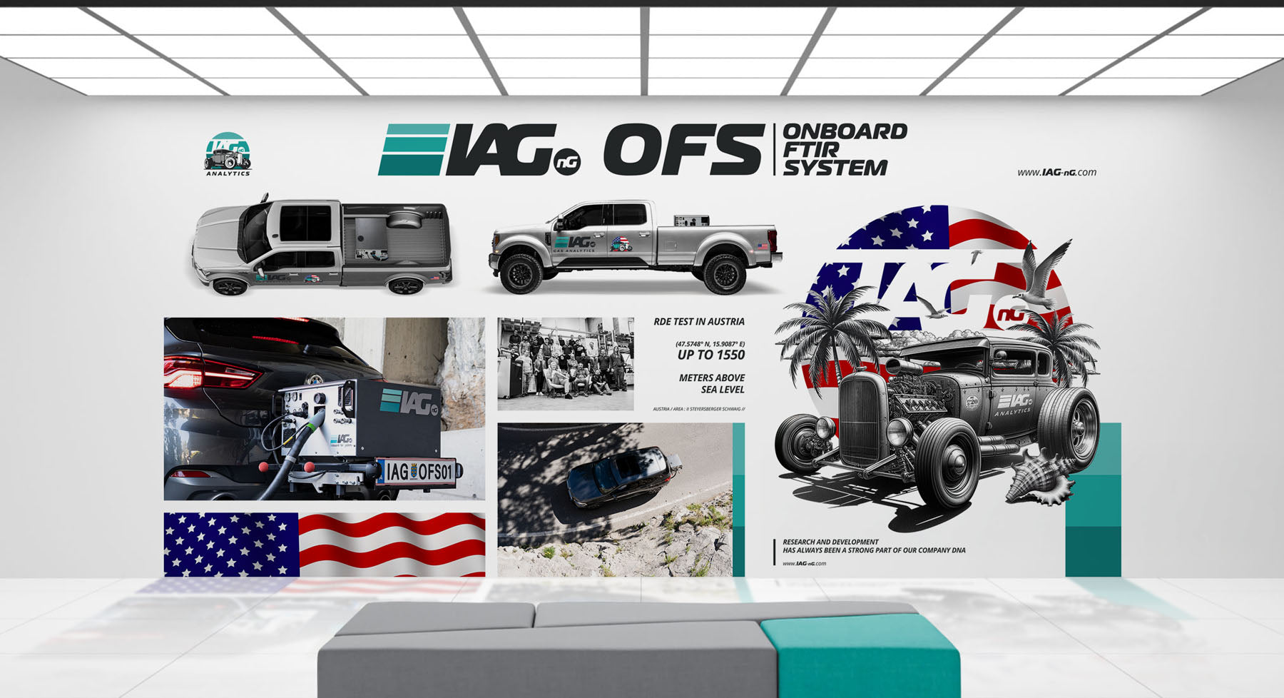
USA booth
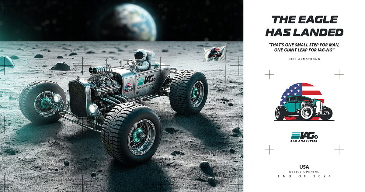
Marketing material USA
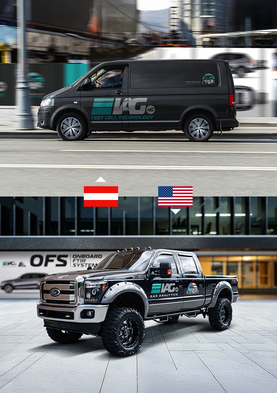
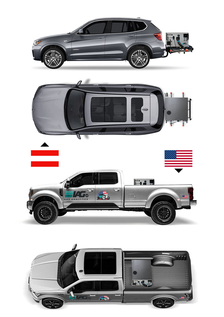
Cultural adaptation
Marketing material USA
The American imagery and marketing materials were deliberately designed to reflect familiar US brands and visual references in the IAG-ng documents. This was intended to appeal to the market with a sense of affinity and cultural connection.
Cultural adaptation
Marketing material USA
IAG-ng's product campaigns also deliberately focused on "Americanization" in order to make the European brand culturally compatible and relevant for the US market.
Lifestyle-inspired uniforms
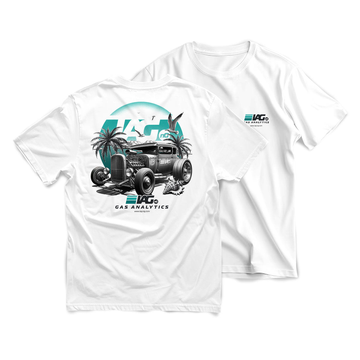
USA-inspired T-shirt
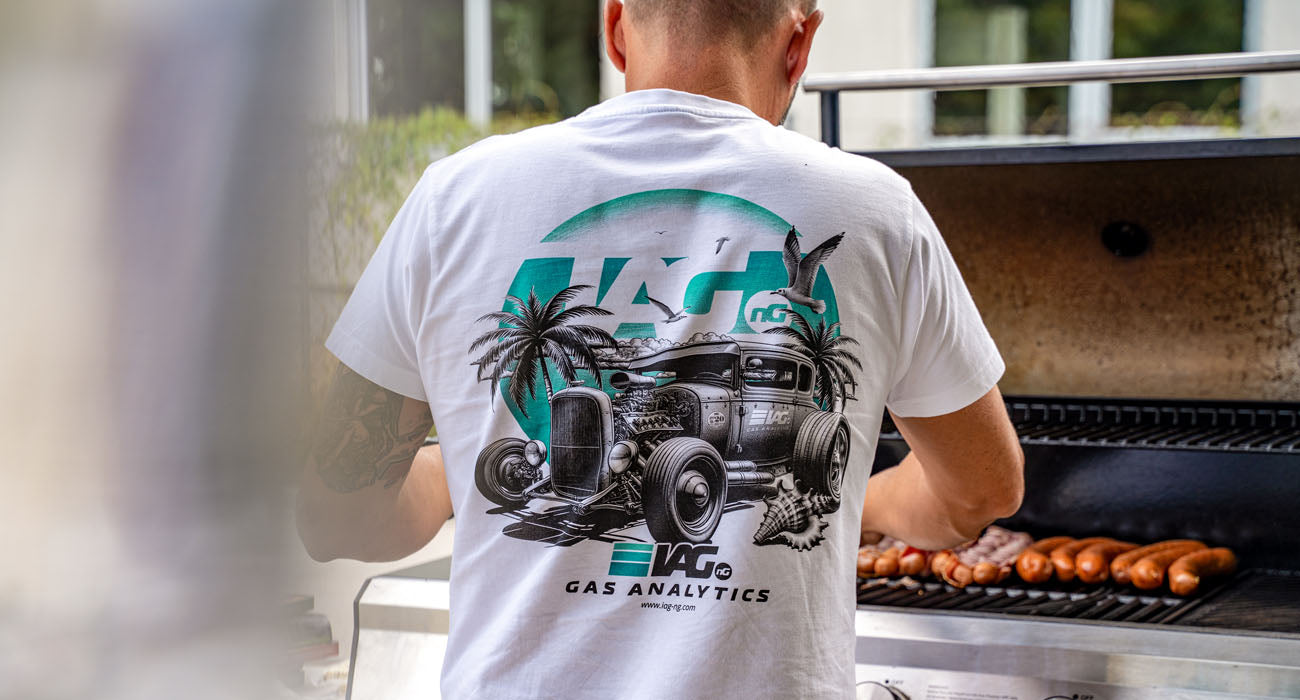
Summer T-shirt
To build bridges between the European and US teams, special T-shirt designs were created: The IAG-ng Hotroad presents itself in a classic, romantic US look – with palm trees, beach and summery lightness.
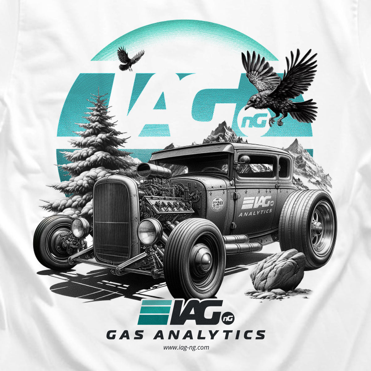
EU-inspired T-shirt
Winter T-shirt
The European-inspired T-shirt depicts the IAG-ng Hotroad in a snowy Alpine style. A visual statement for shared identity and cultural diversity.
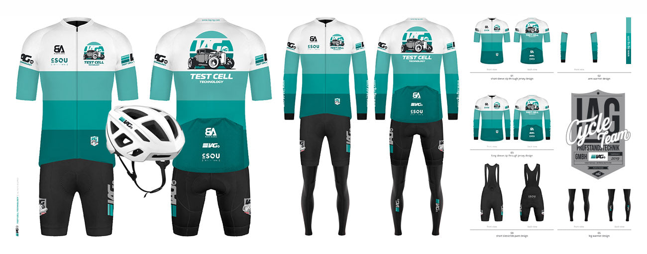
IAG-ng Cycle Team Kit
The Recruitment Design Line
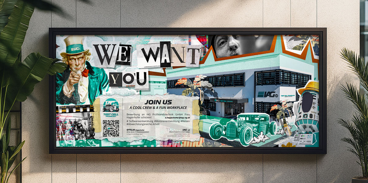
Cut and Paste
Grunge meets brand structure
The expanded branding and its elements resulted in a "cut-and-paste" look that functions as a "graphic hook" – familiar in style, as the target group of lifestyle and sports brands knows it, reimagined in the context of IAG-ng.
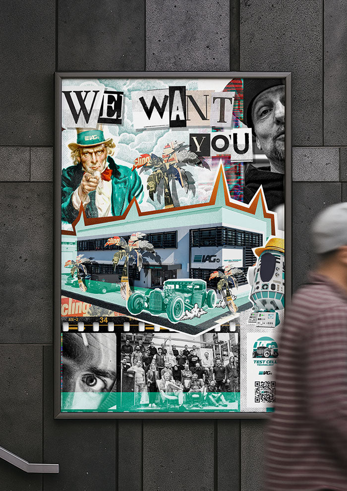
flexible & modular
Recruitment Graphic Hook
The design of the “Recruitment Graphic Hook” was conceived in such a way that it could be used modularly in a wide variety of layouts and formats – from print to digital to social media.