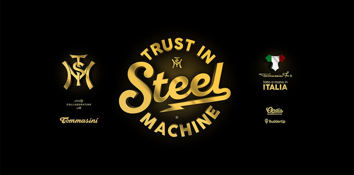
Trust in Steel Machine
Trust in Steel Machine
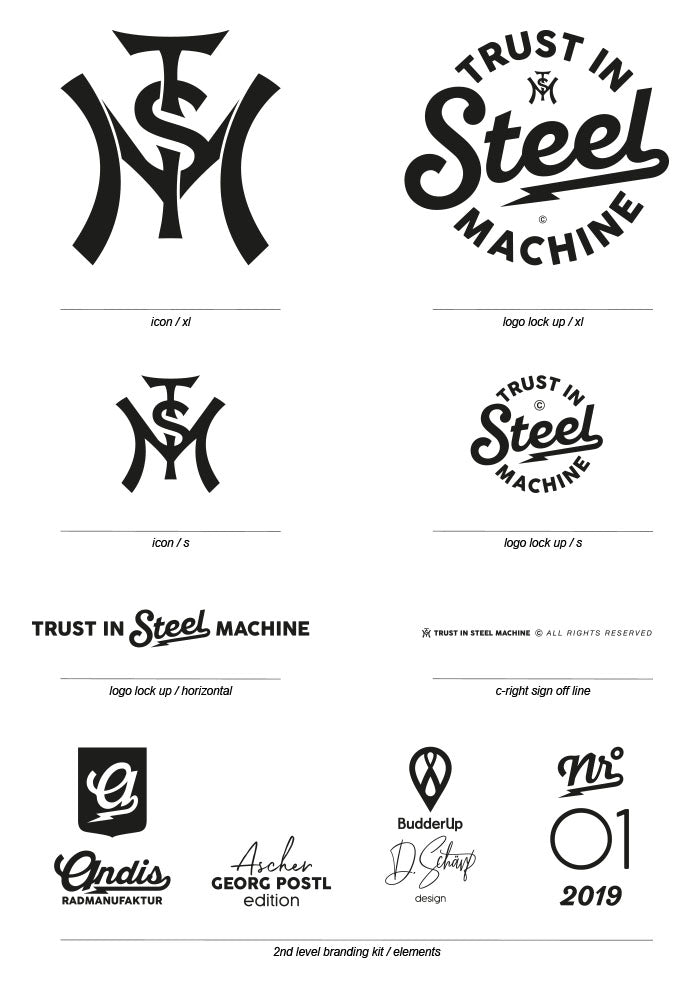
Basic Branding Kit
Based on the historically classic branding positions on bicycles, as well as the versatile applicability to clothing and other product categories, a brand formula was developed that combines vintage character with modern aesthetics. Since the high-priced steel frames were also to be equipped with contemporary performance components, it was essential to make this mix of tradition and innovation visible in the branding – and to appear relevant to both vintage enthusiasts and performance athletes.
Trust in Steel Machine
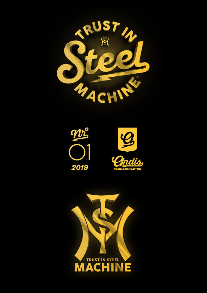
Br.-Kit Extension
TISM's branding evolved from a flat, vector-based design to a more dynamic, spatially evocative visual identity. This transformation was driven by the need to create a distinctive presence across print advertising, point-of-sale displays, and various in-store print materials.
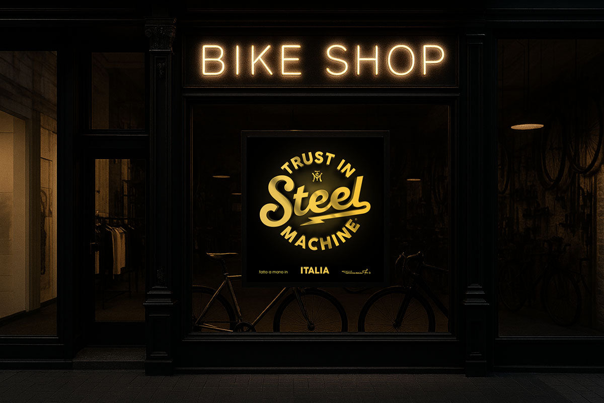
TISM / Shopposter
Minimal advertising space
With limited advertising space, the brand should have a visually dominant effect through a clear and concise corporate identity.
A consistent design, strong color scheme and brand-typical elements ensure that the message remains immediately recognizable and memorable, even in the smallest space.
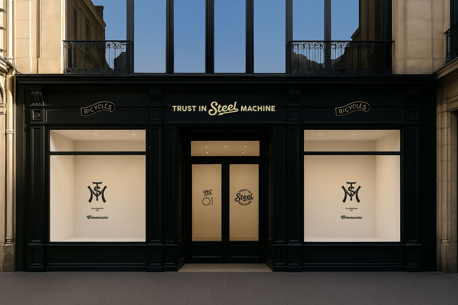
TISM / Private Label Shop Branding
Concept Store
Within the framework of a dedicated concept store, the possibilities for brand communication are explored in a targeted manner. Logo placements are deliberate and understated, resulting in a clear, precise, and timeless brand aesthetic. The design remains minimalist and does not distract from the products or campaigns displayed in the window – it creates space for impact and identity.
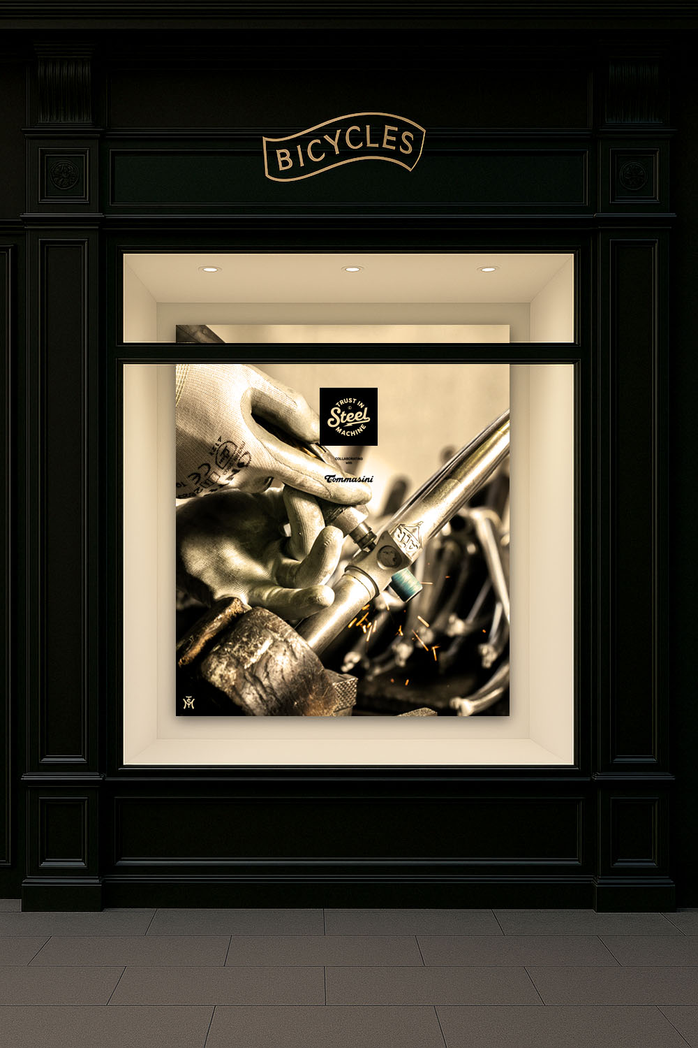
visual language in marketing
campaign
At the heart of the campaign is original imagery from the iconic Italian frame manufacturer Tommasini. This authentically and visually compellingly tells the story of the handcrafted steel frame. Each step of the process – from raw material to final finish – is presented as a distinct campaign visual based on historical archive images. The result is a continuous, engaging rollout that highlights craftsmanship, heritage, and character, making the brand's values tangible.
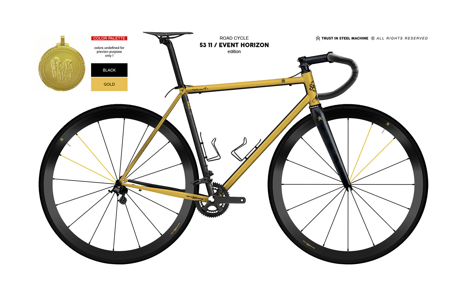
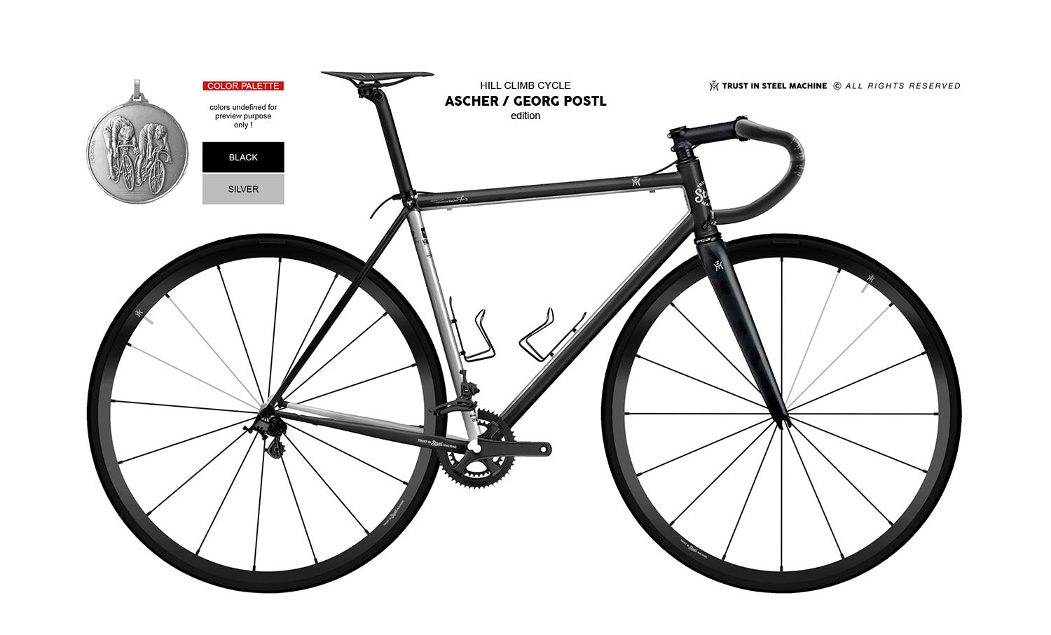
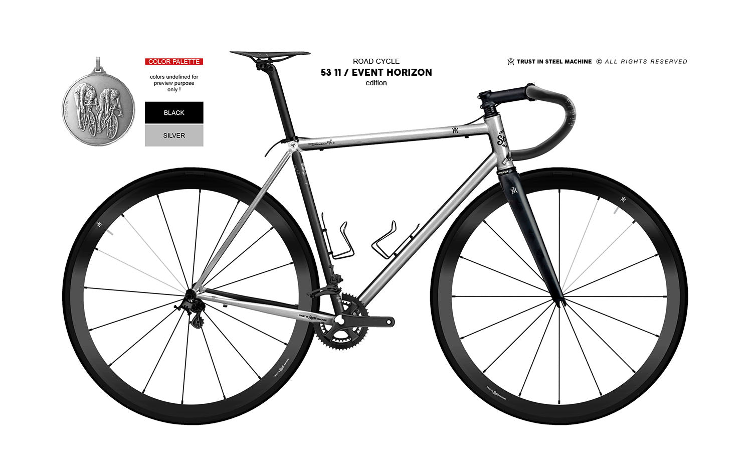
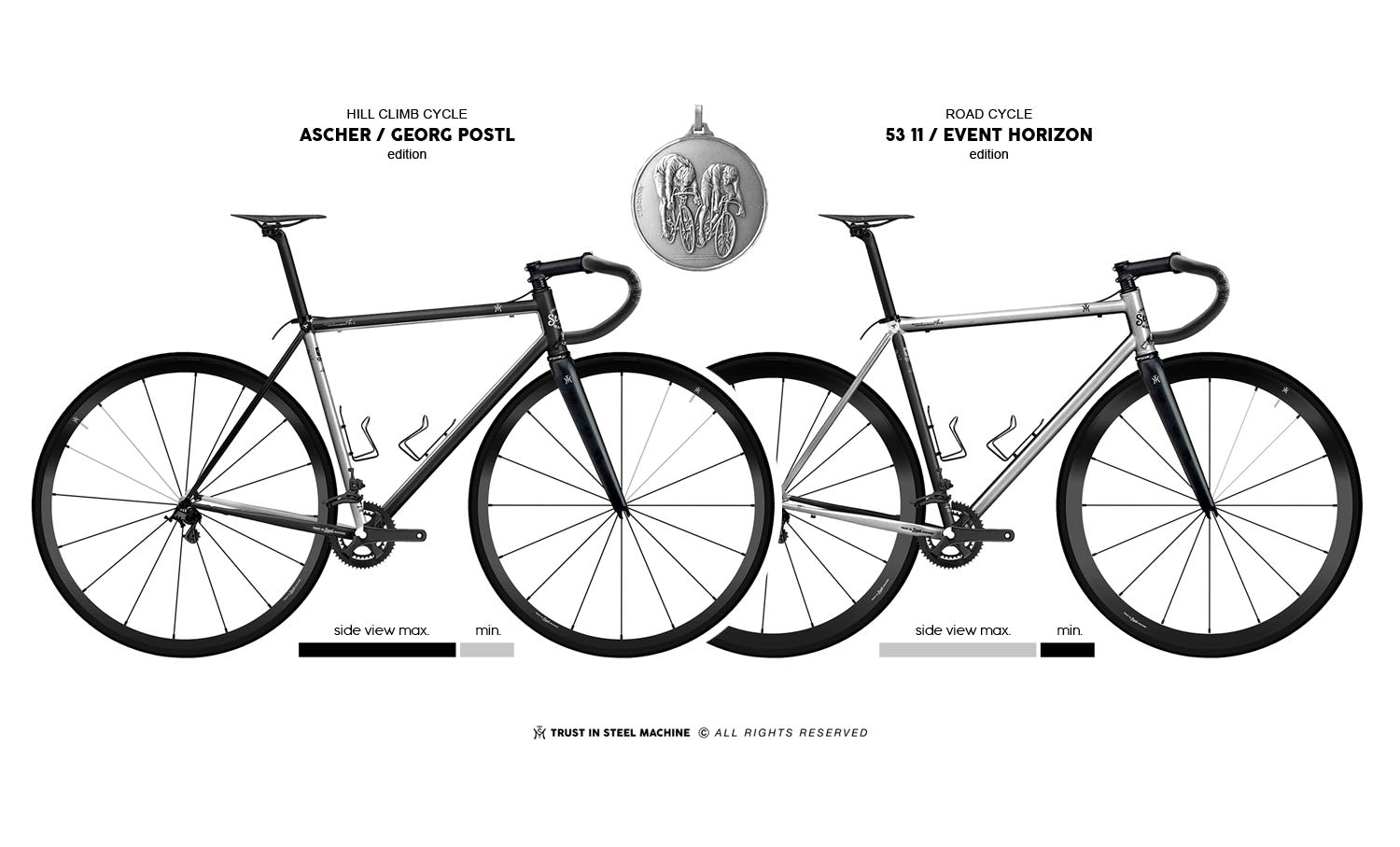
The signature frame design
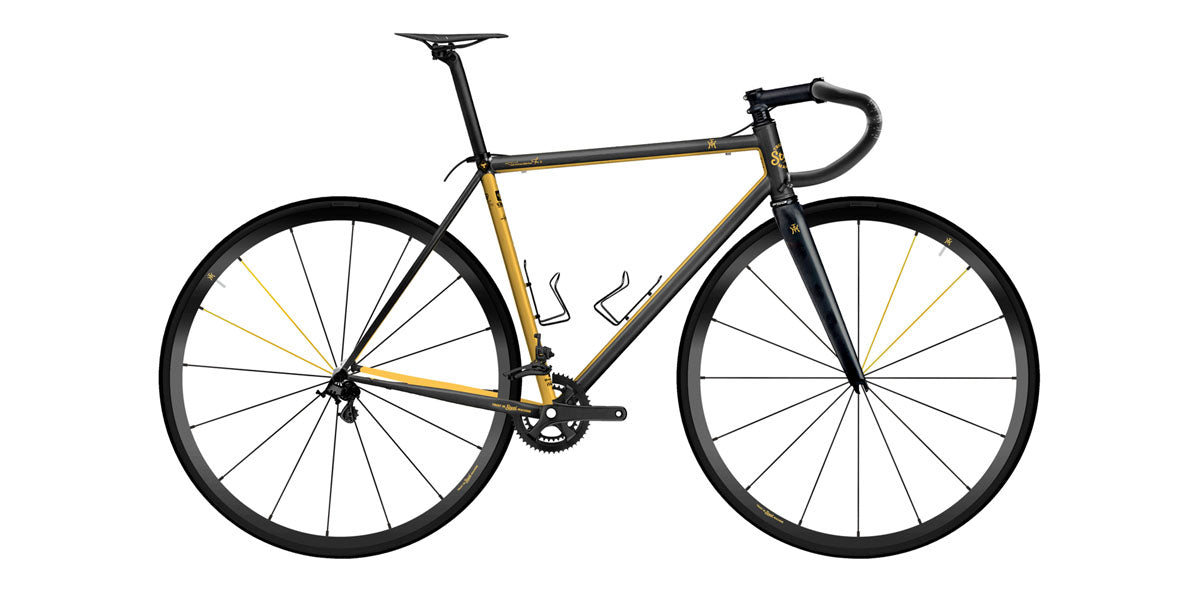
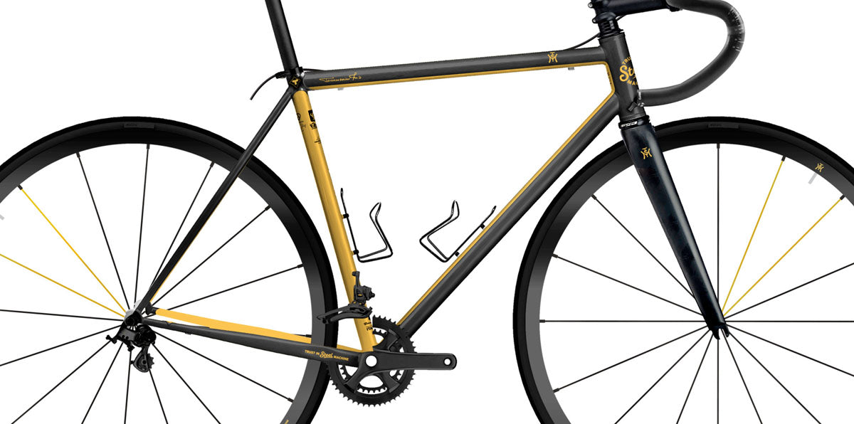
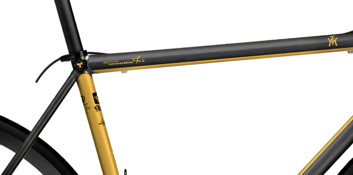
The Signature Color System
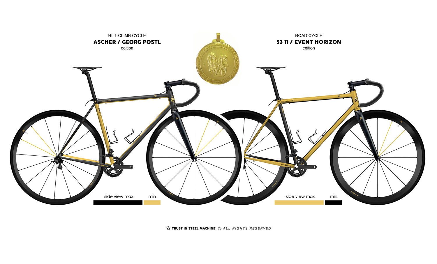
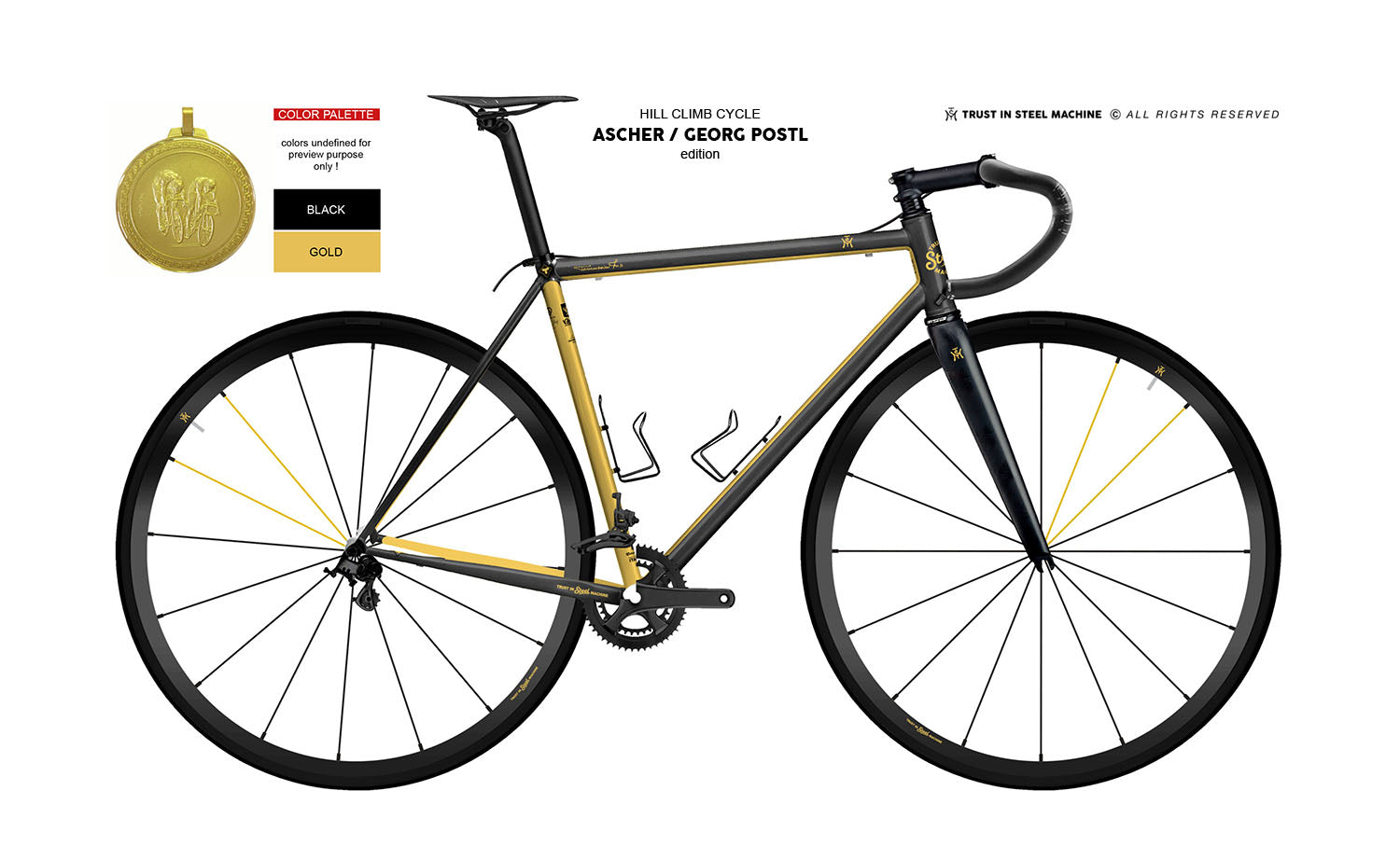
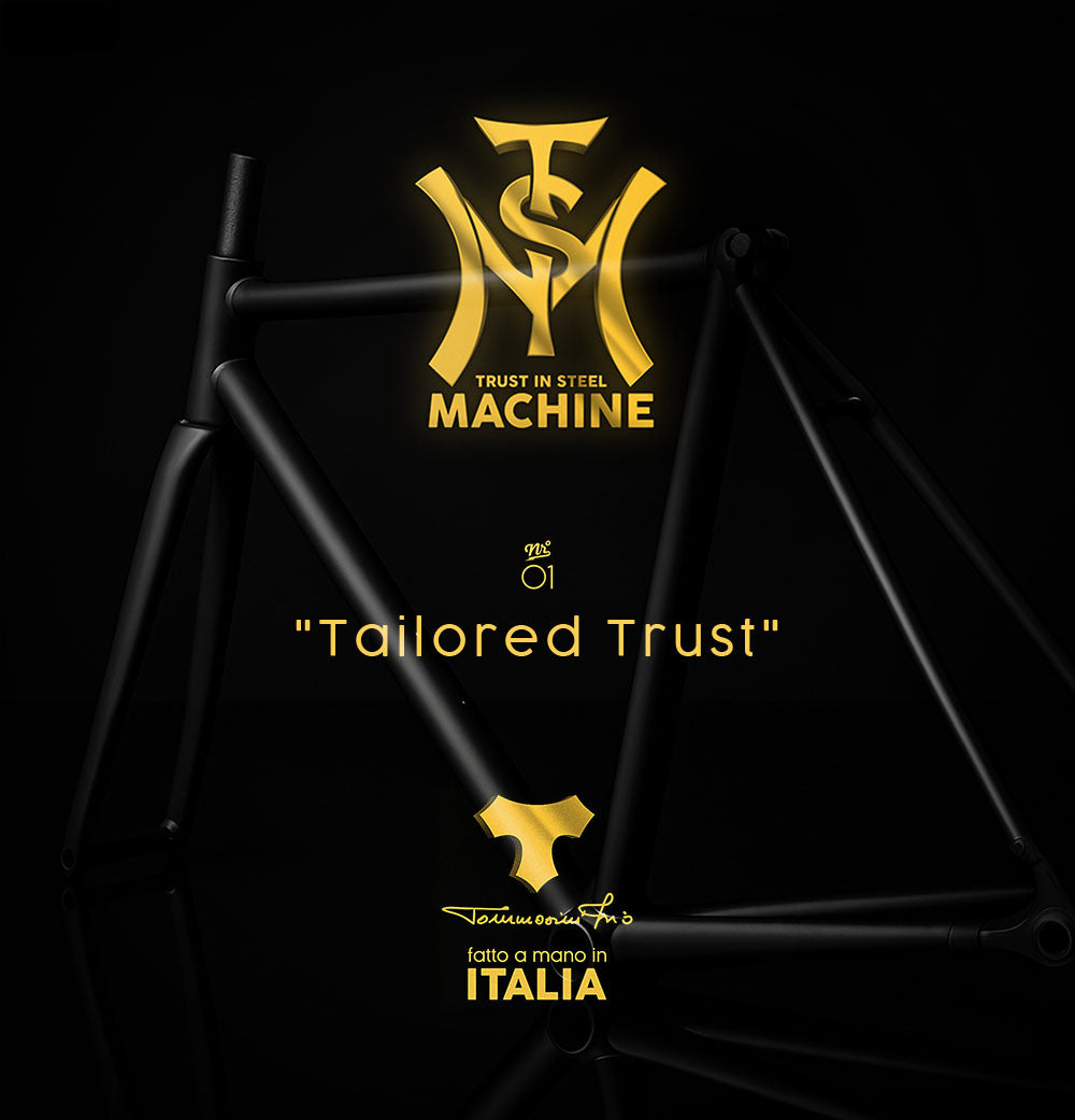
TISM / "Tailored trust"
Custom Program
Tailored Trust stands for true individuality. After precise measurements of the customer, a custom-made frame is created – in the customer's two chosen colors, with a personal logo or name on the top tube. A unique piece that inspires confidence.
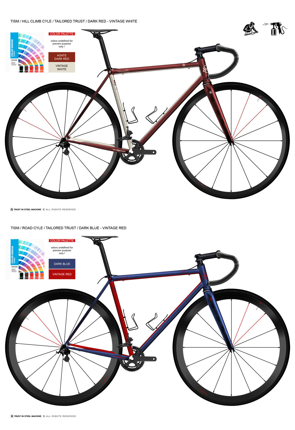
TISM / "Tailored trust"
Desired colors
Individualization with a system.
The customer determines the look – within the defined signature formula. Whether matte, glossy, or metallic: Each frame is painted exactly according to the desired color and remains unmistakably true to the brand.
This form of customization enables a scalable implementation of custom paint jobs without overloading the production processes.
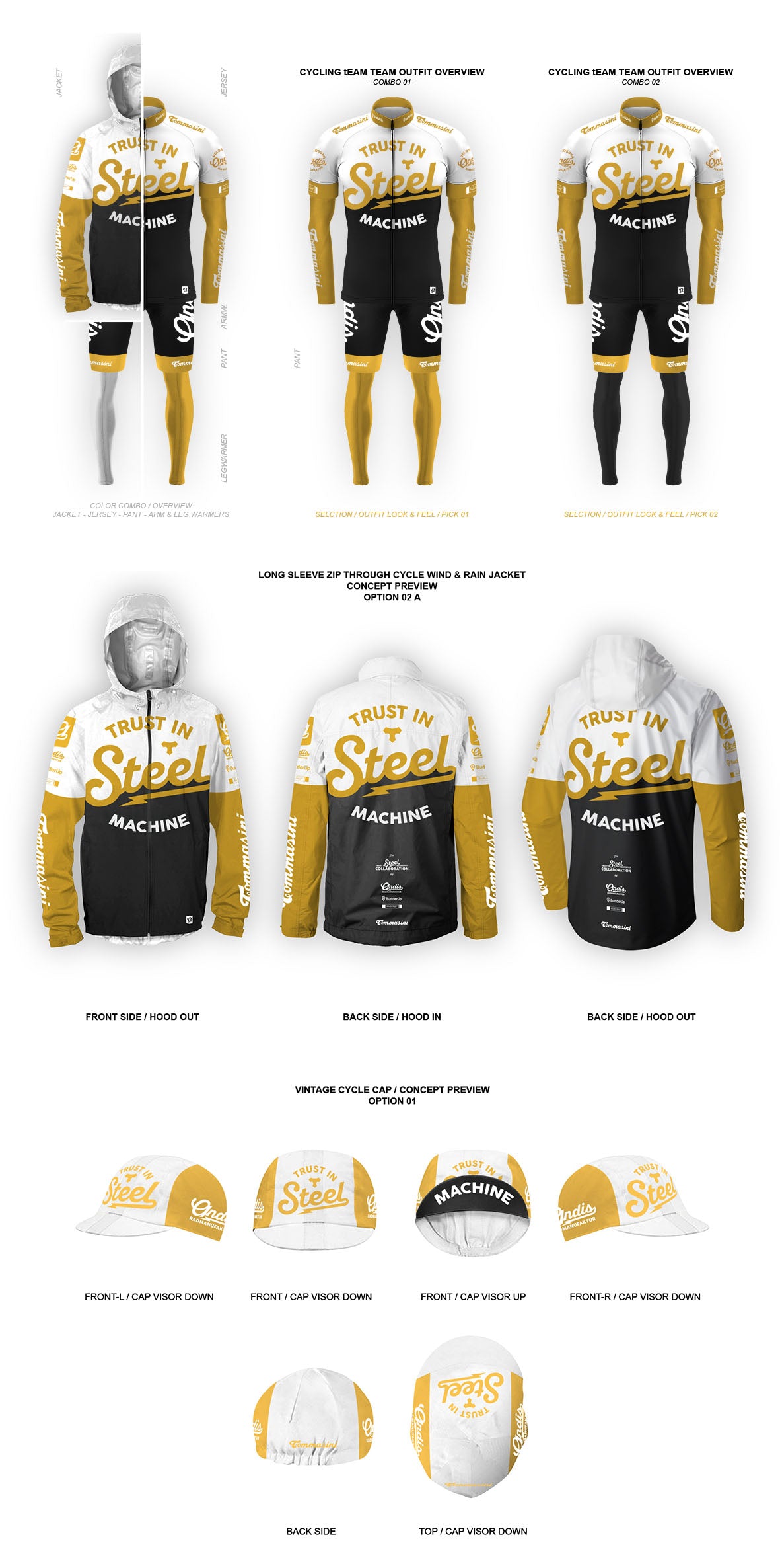
Cycling apparel concepts
Two colors for the bike. Three for the rider.
The cycling apparel collection is directly inspired by the design of the steel frame. While the bike itself embodies a clean, minimalist brand aesthetic with its two colors – black and gold – the apparel expands the palette to include ice white.
This third color was deliberately added to create technical clarity, visual freshness, and functional differentiation. White acts as a neutral contrast, highlighting details and lending the collection a modern lightness. This results in a harmonious overall look where clothing and frames merge seamlessly in design and concept – minimalist, high-quality, and uncompromising in its message.
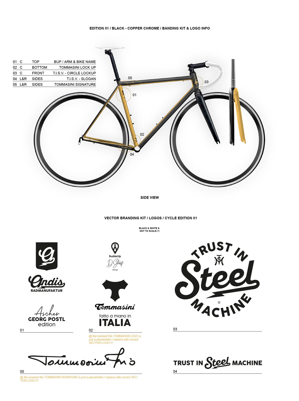
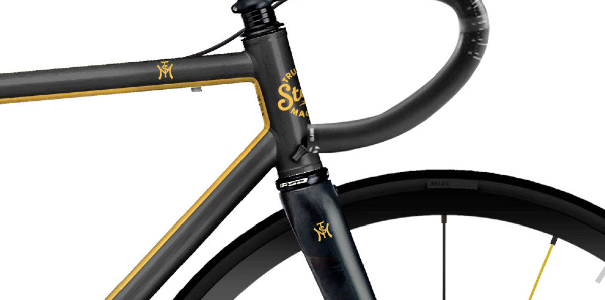
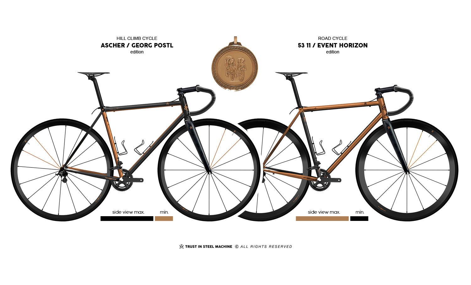
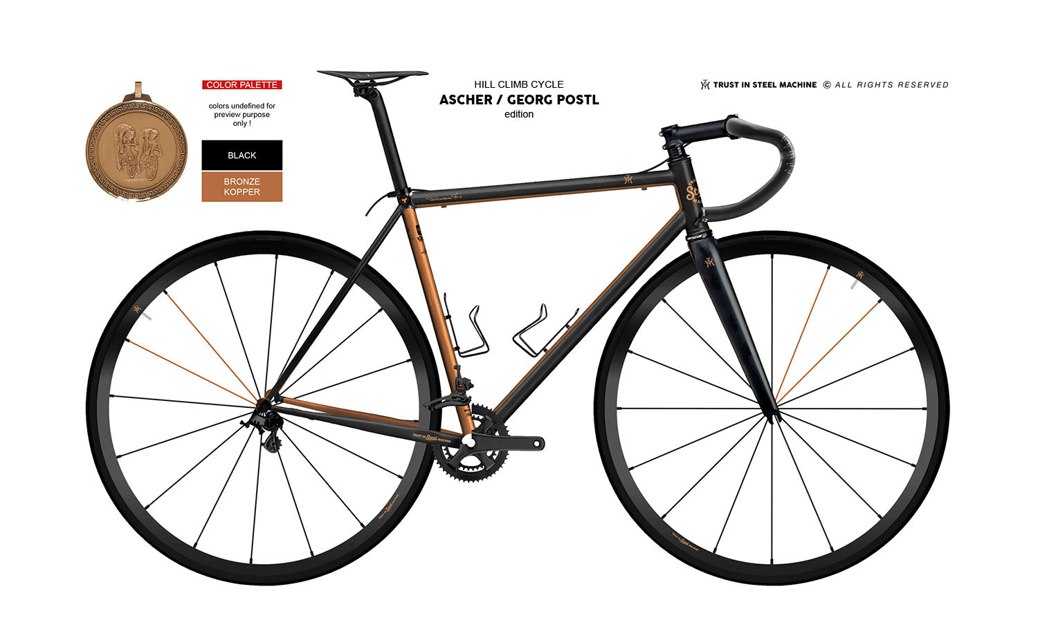
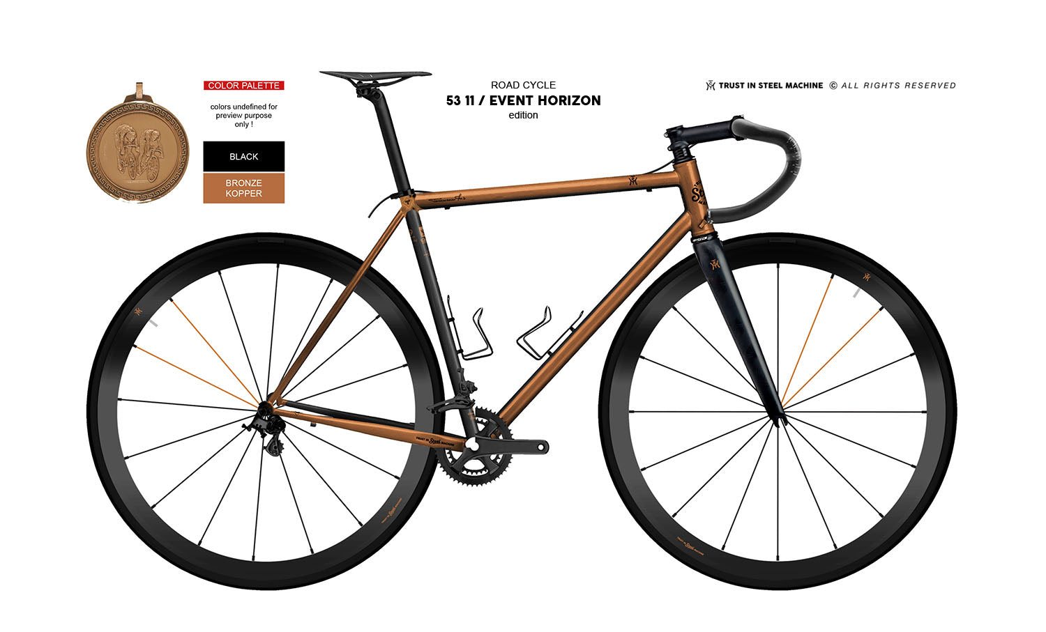
Logo positioning on a racing bike
The brand identity of a steel racing bike is defined by clearly defined logo positions and proportions. Specification sheets specify exactly where and how the logo appears – for example, on the head tube, top tube, or fork.
Whether as paintwork, decals, or engravings: every application follows the frame geometry and emphasizes the craftsmanship. Color choice, contrast, and proportions create a minimalist, timeless aesthetic that subtly conveys origin and attitude – technically precise and visually compelling.
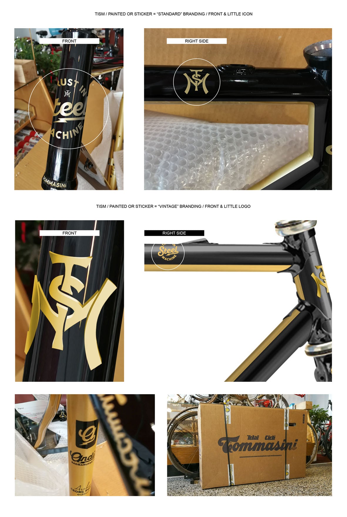
Head tube emblems
Head tube branding according to equipment.
The choice of head tube emblem depends on the specifications and the customer's desired components. If the frame is built for performance purposes and equipped with contemporary parts, the racing bike receives the angular TISM icon – a symbol of technical precision and modern design.
In contrast, a vintage-inspired build with classic components features the round TISM LockUp logo. It represents heritage, craftsmanship, and the aesthetics of the traditional steel frame. In this way, the branding becomes not just a design detail, but an expression of the bike's individual character.
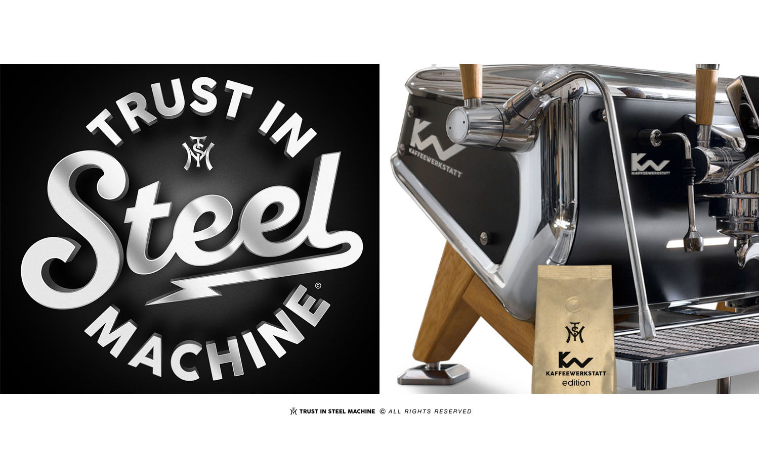
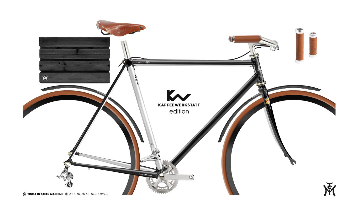
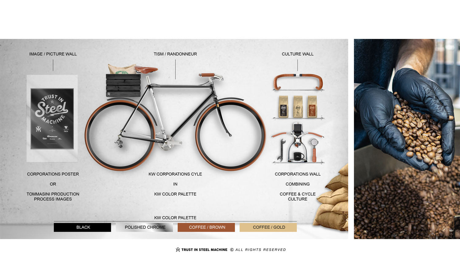
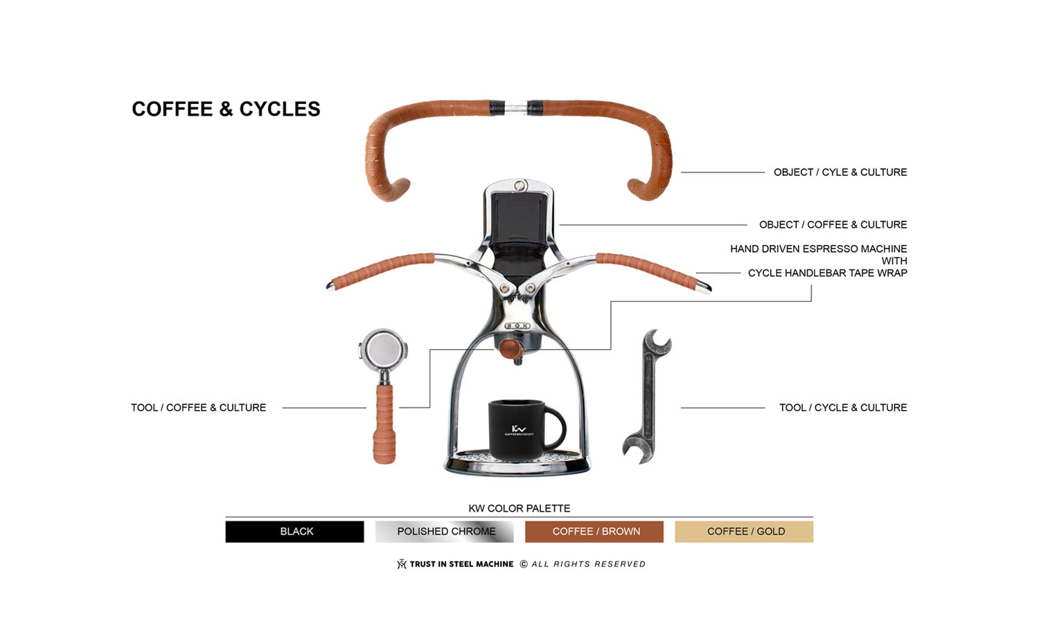
The coffee workshop “Coffee Racer”


